Design in the Library: MLA Webinar “Making Your Library Promotion Pop!”
I attended a great Medical Library Association (MLA) webinar entitled “Making Your Library Promotion Pop! Practical Design Principles and Tools for the Non-Designer” last week by April Aultman Becker, Education Coordinator for the Research Medical Library at the University of Texas MD Anderson Cancer Center. Though originally held in September, it was re-hosted courtesy of Capital Health, Health Sciences Libraries and through the marvels of modern technology.
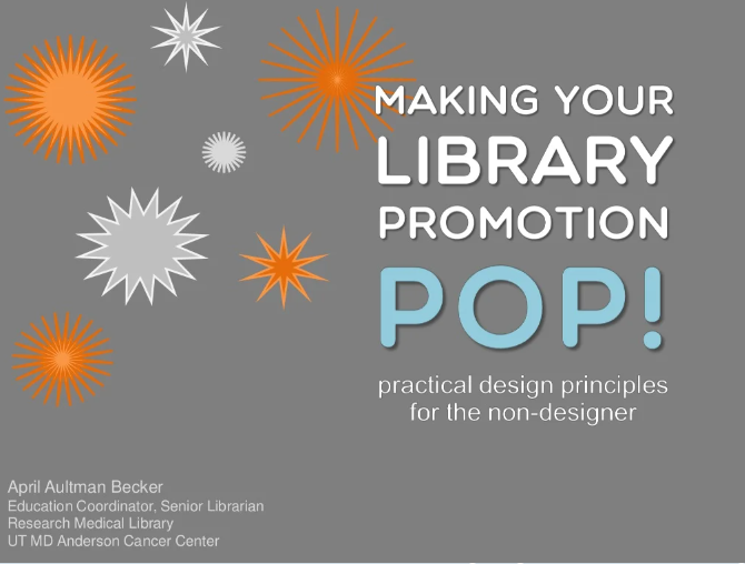
Making your library promotion pop from UT MD Anderson Cancer Center Research Medical Library
I really liked the presentation and thought Aultman Becker did a great job of laying out the design principles, showing some really effective examples, and – my favourite – drawing on design submissions from the September attendees to illustrate the successful use of various principles. It was a great idea to get everyone to submit some work ahead of time, because it served as a showcase of the talent of other librarians, and also boosted everyone’s confidence (if all these other librarians can make cool posters, I can too!). This is why I think her work in Librarian Design Share is so awesome – it’s essentially an inspiration/sharing/discussion blog about design in the library and the ways in which design can help us tackle issues. My favourite so far is this meme graphic explaining boolean operators by Erica DeFrain.
It was funny though, because a lot of the various design principles Aultman Becker discusses seem like such common sense, “Yes – contrast is good, make things stand out!” “Proximity, group things together, I get it.” “Use alignment to connect things visually, of course!” “Use repetition to create consistency, definitely.” but how often have we seen (or worse, made them ourselves) posters and signs that totally flout these principles?
Since attending the webinar, I’ve definitely thought more about what I was doing from a design standpoint, and caught myself thinking, “You know what? This header needs to contrast more from the body of the text,” or “the alignment here is totally messing with the flow of this page”.
I’m definitely going to have to start a Pinterest board just for my design inspiration!